Thrive in ’25
We’re here to help you Market Smarter with innovative print, signage, and promotional solutions designed to put you in the fast lane to success.
We’re here to help you Market Smarter with innovative print, signage, and promotional solutions designed to put you in the fast lane to success.
What’s New in ’22? We are happy to announce a number of new and expanded offerings to help you Market Smarter.
In response to continued supply chain shortages, CustomXM (CXM) announced a new product to increase revenue streams.
Apparel is an ever-evolving promotional product with constantly changing new styles to keep up with. As apparel promo products change each year, how are you standing out from the competition? Check out our top apparel trends for 2022 below so you can stay on top of it all!
For an inside look at the ever-changing color trends for apparel, promo, design and beyond, look no further than Pantone’s top colors for 2022! Stay on-trend and top-of-mind this spring with these calming yet bright shades that are sure to keep your customers’ attention.
In honor of Black History Month, we want to take the time to recognize some of the inventors, printers, and designers that helped move our industry forward. From peanuts and presses to newspapers and 7-UP, these forward-thinkers and their ideas helped shape our industry as we know it.
Ben E. Keith, a distributor of food service products and premium alcoholic beverages, located in North Little Rock, Arkansas, hosts an annual Mid-South Food Show. The one-day show featured technology demonstrations, over 150 of their vendors showcasing their latest items, an American Culinary Federation Culinary Competition, guest speakers, and even a party the night before.
They wanted a special look for this years event. It was important that the look communicate their overreaching focus of simply providing customers with fundamental tools they need to succeed. They also desired an fun, creative and edgy look that fell in-line with the spirit and goals of both the company and the event.
The solution was a logo that literally spotlights a spoon in front of an audience. The logo would be used on specially die-cut hexagon shaped brochure that would be distributed to customers during food deliveries. They also used JPG images from portions from the design to promote aspects of the event in their client email campaigns during the weeks leading up to the event.
Historically, the speaking portion of the event had not yielded a great deal of interest from participants. However, this year they had made a special effort to acquire speakers they thought would generate interest and likewise wanted to be sure those seats were filled. Because of the time constraints of the show, the keynote speaker would present one hour before the published event start time. The night before the event the staff cut-off the portion of the leftover brochures that featured the speaking schedule on one side and the cover graphic on the other. They handed those out to guests at their party the night before in an effort to drive traffic to both the early speaking event and the mid-day presenter. The result was great. Both the speaking events and the food show was well attended. They indicated that not only was the design creative and very fitting for the event, but that the hexagon brochure design was also key in getting attention and sparking conversation. Their only wish is that they had utilized the logo design in more of the event’s promotional items like tee shirts and banners.
CustomXM added a new division, SignsXM. It wanted to find a unique way to announce its new offerings which included all types of wide format printing, including banners, signage, wall graphics, vehicle graphics and more. CustomXM also wanted to use a cross media, multi-channel approach that would drive results and illustrate CustomXM’s marketing capabilities.

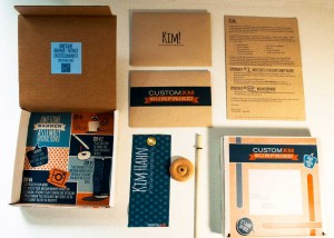
The SignsXM Awesome Banner Thingy Campaign: Complete with personalized box, envelope, personalized mini-banner and a fun-to-follow instruction sheet below. The inside of the box lid had a QR code that led to a fun video
CustomXM created a unique, dimensional mail piece that included a personalized mini-banner for all recipients. CustomXM encouraged recipients of their “Awesome Banner Thingys” to post photos on Instagram, which would qualify them for entry into a prize drawing.
420 pieces were mailed to prospects and current clients of CustomXM. Over 12% of recipients responded and completed the online survey. Additionally, over 13% of the recipients posted photos of their Awesome Banner Thingys on Instagram accounts. Many of these respondents were a different subset than those that responded to the online survey.
The campaign received quite a bit of social media buzz and accolades from local ad agencies. It immediately led to meetings and opportunities for signage and direct mail proposals for clients and prospects. Many of these opportunities led to new business within the first three weeks of the campaign.
This campaign also received national recognition by receiving two Bennys awarded by the Print Industries of America during their Premier Print Awards, an international print competition.
The targeted audience was current clients and prospects of CustomXM.
At CustomXM, they like to market themselves a little differently. They like to use the marketing tools they are constantly advocating, and they like to have a little fun. They accomplished all this and more with their “Awesome Banner Thingy” campaign.
Recently, CustomXM added wide format services to their offerings. They even created a separate division, SignsXM. But they felt that it wouldn’t be enough just to tell folks about these new services, it would be better to show them. And have them show others.
To engage its target audience, CustomXM developed a dimensional mailer – an 8” x 8” x 1.25” box complete with a personalized label informing recipients that a “surprise” was inside. Inside the box was the following:
To encourage responses recipients were given two opportunities to participate in a prize contest

Above: photos posted by Box Thingy recipients. Recipients were asked to post photos of their banner-thingys on Instagram with the hashtag #thinkitsignit. The Instagramers were entered into 3 different sets of drawings for prizes and winners were announced via Instagram videos.
The main reason for success was a clever design and personalized promotion.
Article courtesy of W. Caslon & Company, 2015, PODi.org
Riddle me this…
I’m confused.
I have always been somewhat of an early adopter, and have embraced technology whenever possible. Yet, my livelihood is dependent upon the use of that ancient form of communication – print. Needless to say, as we begrudgingly continue to one day become that “paperless society”, I can’t help but grin at recent developments to the contrary.
Again I ask…
If we are encouraging our students at the collegiate, high school, elementary and even earlier to immerse themselves in all things digital – especially the tools used to advance their education – how do professors justify removing these same tools giving similar reasons?
If online shopping continues to grow exponentially, why would a major retailer bring back a dinosaur of a catalog?
A scientific response could be that neuroscience studies show that physical media such as print leaves a deeper footprint on the human brain than the virtual. I think this suggests that if I write down my grocery list I will remember it better than if I type it in my notes on my phone (with the underlying assumption that I leave both the list and my phone in the car).
But I never did like science. So let’s explore further.
Learning & Literacy
Recent studies continue to indicate how in spite of all the tech tools available to us, print, paper and yes, even handwriting deliver proven benefits and continue to play an essential role in education and development.
Catalog to Internet Sales
J.C. Penney has struggled over the years. It has continued to try to crawl its way back from recent sales declines. So why do they decide to bring back this antiquated, phone book style medium? The answer, it appears, is that in some instances, “if you build it, they didn’t come.” When Penney’s decided to discontinue the Big Book in 2009, it was anticipated that catalog shoppers would migrate online. But it didn’t actually pan out that way. The company eventually learned that a lot of what they thought were new online sales were actually catalog shoppers using the website to place their orders. And after a half-decade hiatus, it is bringing back its catalog.
Now, retailers are rediscovering the books as a branding tool that can drive sales. According to Kurt Salmon, 31% of shoppers have a catalog with them when they make an online purchase.
What then, does this tell us?
Print drives sales! And print helps you learn and remember!
As if you and I didn’t already know that.
Now where did I put that grocery list???

Paul Strack [email protected] @pstrack
