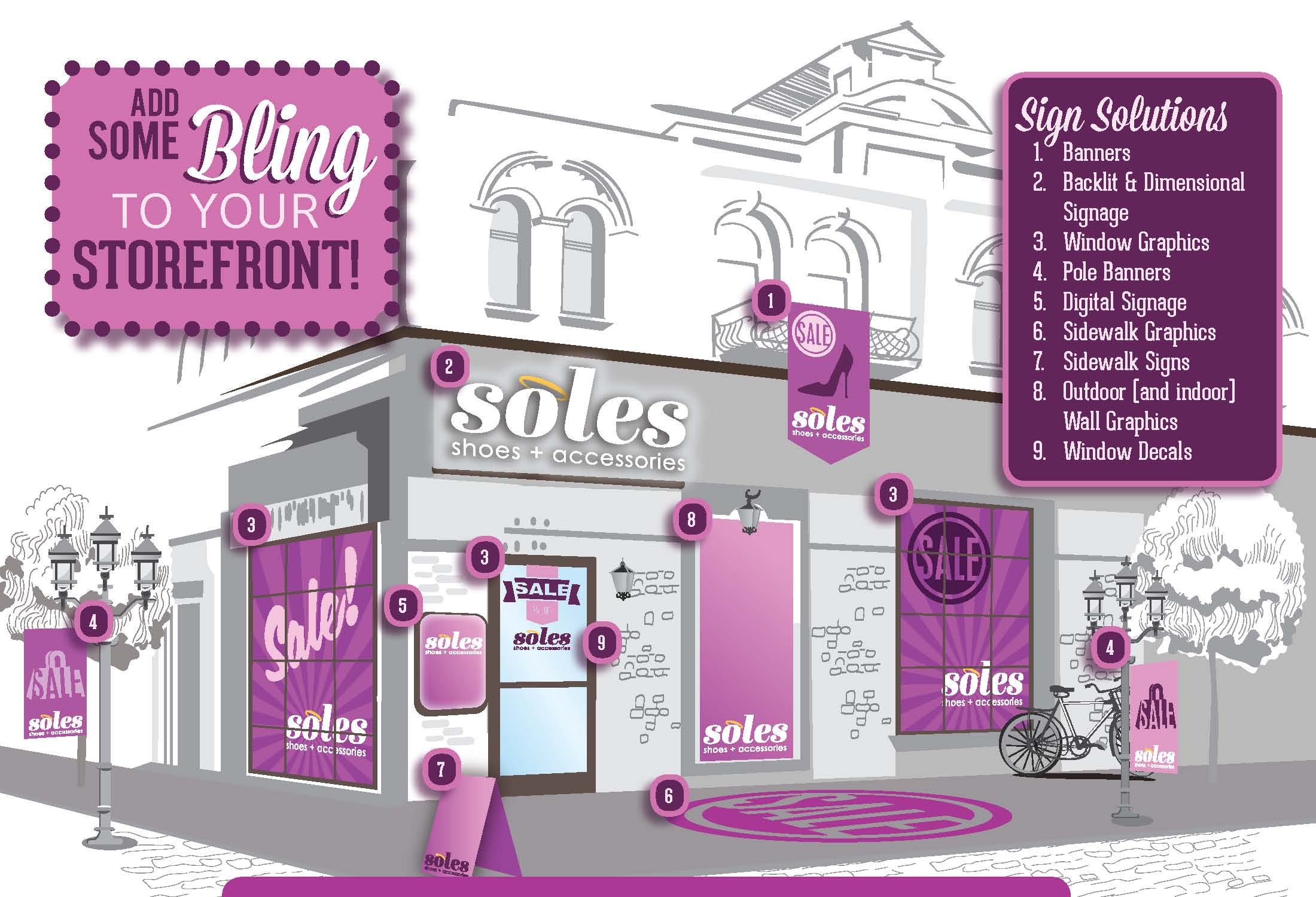
Add Some Bling To Your Storefront
We all know the secret to retail success – Location, Location, Location. Let’s assume you have your perfect location, you secured your ideal piece of real estate, so now what?
You must now let the world know – tell your customers who you are and what you are all about. And there is no better, more cost effective way to do this with exterior and interior graphics. Here’s why:
- The brain processes visual information 60,000 times faster than text.
- Signs do more than just look pretty – they work hard 24/7. And the best signs do this:
- They Inform
- They Sell
- They Educate
- They Entertain
Retail signage and graphics tell a story, leave an impression and set a tone. The proper signage inside and outside of a store can inspire confidence with customers and employees alike.
So here are few tips to help with your retail sign efforts:
- Use photos in your design. According to a DMA study, using a photo creates a 300% greater recall than ads without photos.
- Try to keep headline copy to seven words or less.
- Pay attention to color contrast. Certain color combinations are very appealing for readability – Black on Yellow; Black on white and vice versa. Signs with grays, pinks, light blue may not attract the same attention as stronger color combinations.
- Keep your message simple.
The graphic at the top gives several examples of effective, affordable uses of exterior signage. But remember, interior signage such as Sale signs, floor graphics, POP displays are equally effective and affordable.
And get this – Full priced merchandise that has signage outperforms sale merchandise that doesn’t have a sign by 18% (in a study performed by the Institute of Retail Management).
Take a look around inside and outside your store. Does your signage set the right tone? Does it inform, educate or entertain. Most importantly, does your signage sell?
If not, we can help.
Need photos of interior or exterior graphics? Go here.

Paul Strack [email protected] @pstrack


