The Signs of Autumn in Arkansas
How to mprove your fall events with vibrant signage that boosts wayfinding, branding, safety, and attendee engagement.
How to mprove your fall events with vibrant signage that boosts wayfinding, branding, safety, and attendee engagement.
CustomXM added a new division, SignsXM. It wanted to find a unique way to announce its new offerings which included all types of wide format printing, including banners, signage, wall graphics, vehicle graphics and more. CustomXM also wanted to use a cross media, multi-channel approach that would drive results and illustrate CustomXM’s marketing capabilities.

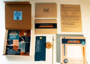
The SignsXM Awesome Banner Thingy Campaign: Complete with personalized box, envelope, personalized mini-banner and a fun-to-follow instruction sheet below. The inside of the box lid had a QR code that led to a fun video
CustomXM created a unique, dimensional mail piece that included a personalized mini-banner for all recipients. CustomXM encouraged recipients of their “Awesome Banner Thingys” to post photos on Instagram, which would qualify them for entry into a prize drawing.
420 pieces were mailed to prospects and current clients of CustomXM. Over 12% of recipients responded and completed the online survey. Additionally, over 13% of the recipients posted photos of their Awesome Banner Thingys on Instagram accounts. Many of these respondents were a different subset than those that responded to the online survey.
The campaign received quite a bit of social media buzz and accolades from local ad agencies. It immediately led to meetings and opportunities for signage and direct mail proposals for clients and prospects. Many of these opportunities led to new business within the first three weeks of the campaign.
This campaign also received national recognition by receiving two Bennys awarded by the Print Industries of America during their Premier Print Awards, an international print competition.
The targeted audience was current clients and prospects of CustomXM.
At CustomXM, they like to market themselves a little differently. They like to use the marketing tools they are constantly advocating, and they like to have a little fun. They accomplished all this and more with their “Awesome Banner Thingy” campaign.
Recently, CustomXM added wide format services to their offerings. They even created a separate division, SignsXM. But they felt that it wouldn’t be enough just to tell folks about these new services, it would be better to show them. And have them show others.
To engage its target audience, CustomXM developed a dimensional mailer – an 8” x 8” x 1.25” box complete with a personalized label informing recipients that a “surprise” was inside. Inside the box was the following:
To encourage responses recipients were given two opportunities to participate in a prize contest

Above: photos posted by Box Thingy recipients. Recipients were asked to post photos of their banner-thingys on Instagram with the hashtag #thinkitsignit. The Instagramers were entered into 3 different sets of drawings for prizes and winners were announced via Instagram videos.
The main reason for success was a clever design and personalized promotion.
Article courtesy of W. Caslon & Company, 2015, PODi.org
With the announcement of a $1 million dollar grant from the U.S. Economic Development Administration, The Arkansas Regional Innovation Hub needed a polished and attractive backdrop for the press conference stage. Not only would it be in the spotlight of the media, but also be host a number of important local, state and federal leaders. SignsXM provided them with a 9’ x 7’ step and repeat backdrop, as well as two 3’ x 6’ foot retractable banner stands.
“In addition to helping us prepare for a major news announcement, we looked to the creativity of CustomXM to give our new location a sense of permanence. The interior and exterior signage and graphics they produced accomplished both with great success.” – Warwick Sabin
SignsXM also provided The Hub with window decals to add additional exterior branding to an exterior that is still a work in progress. A large acrylic contour cut Launch Pad sign greets the guest from the entrance facing Broadway.
“The banners and backdrops created by CustomXM not only allow us to brand internally, we also use them for events and activities outside of the Innovation Hub.” – Warwick Sabin
The $1 million dollar grant will allow the Hub to complete building renovations, including establishing the Silver Mine co-working space.
We all know the secret to retail success – Location, Location, Location. Let’s assume you have your perfect location, you secured your ideal piece of real estate, so now what?
You must now let the world know – tell your customers who you are and what you are all about. And there is no better, more cost effective way to do this with exterior and interior graphics. Here’s why:
Retail signage and graphics tell a story, leave an impression and set a tone. The proper signage inside and outside of a store can inspire confidence with customers and employees alike.
So here are few tips to help with your retail sign efforts:
The graphic at the top gives several examples of effective, affordable uses of exterior signage. But remember, interior signage such as Sale signs, floor graphics, POP displays are equally effective and affordable.
And get this – Full priced merchandise that has signage outperforms sale merchandise that doesn’t have a sign by 18% (in a study performed by the Institute of Retail Management).
Take a look around inside and outside your store. Does your signage set the right tone? Does it inform, educate or entertain. Most importantly, does your signage sell?
If not, we can help.
Need photos of interior or exterior graphics? Go here.

Paul Strack [email protected] @pstrack
