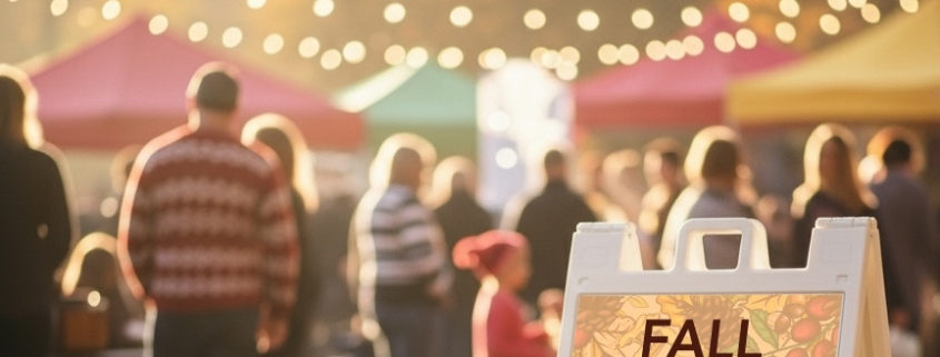
The Signs of Autumn in Arkansas
How to mprove your fall events with vibrant signage that boosts wayfinding, branding, safety, and attendee engagement.

This is where we’ll post summaries of CustomXM client projects. Here you’ll get a better idea of what we do for our print, marketing and signage clients the strategy and the outcomes of some of our campaigns. You’ll also catch some client testimonies and see some or our cool design work, too.
How to mprove your fall events with vibrant signage that boosts wayfinding, branding, safety, and attendee engagement.
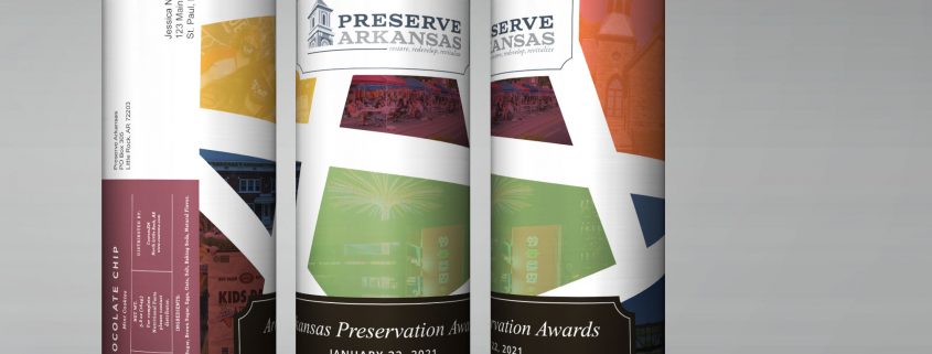
A case study of a sweet solution for the Arkansas Preservation Awards, in a time of social distance and zoom meetings!
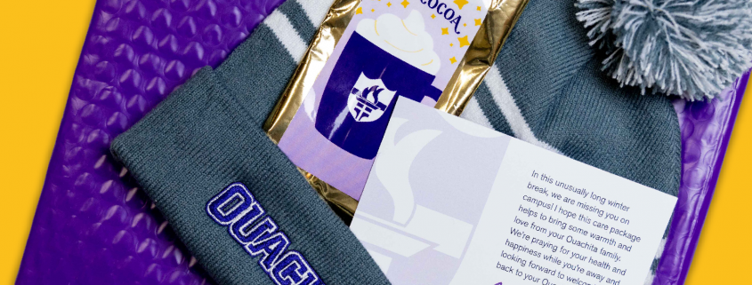
Winter break for college students is normally a lengthy vacation. I recall I always enjoyed the downtime, the home cooked meals, and the holiday. But I fondly remember that when it was time to start the spring semester, I was more than ready to return to campus. But when you add to that break, a pandemic that includes remote classes that began weeks or months before the Holiday break, the time away from campus can seem like an eternity.
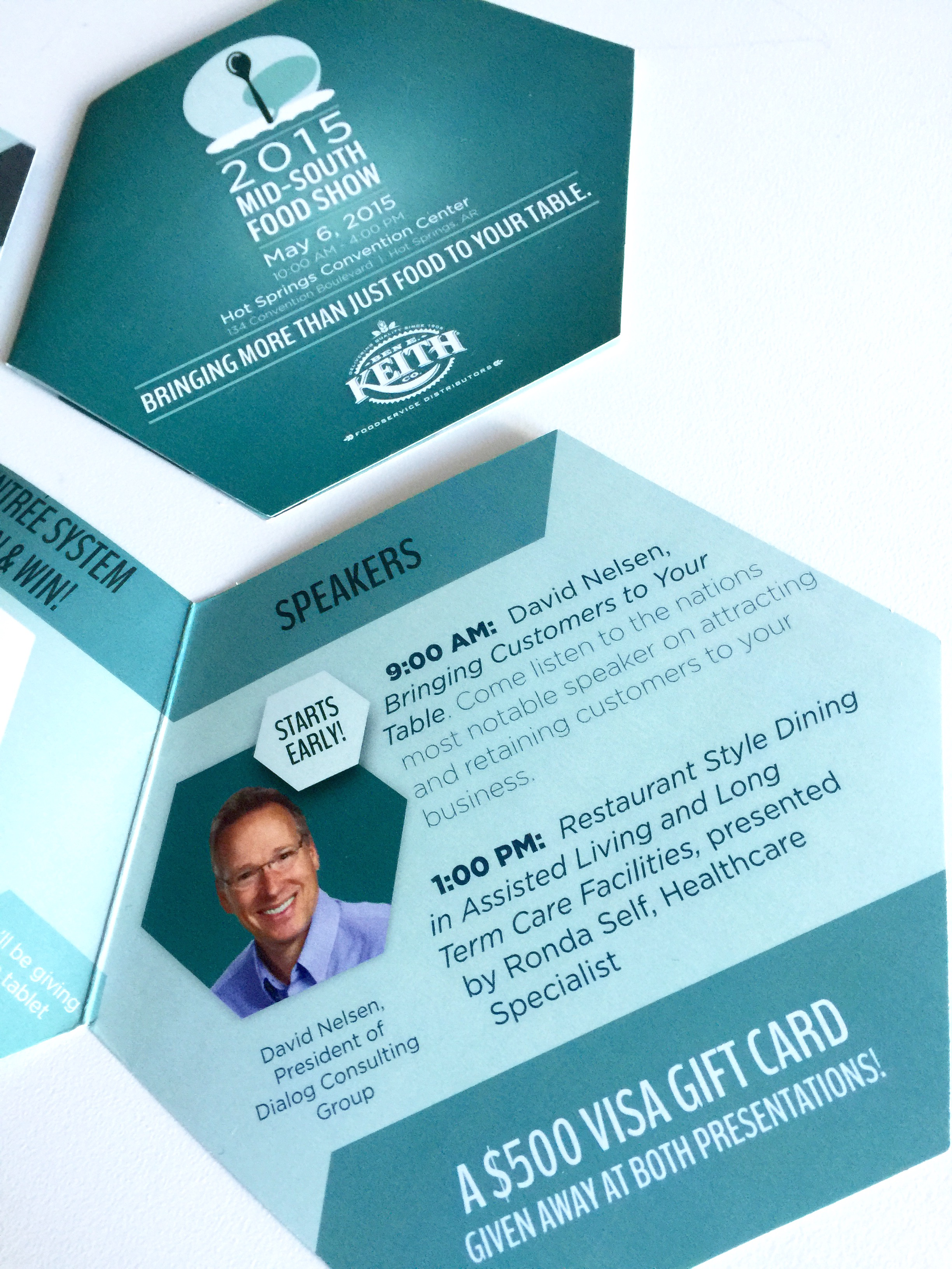
Ben E. Keith, a distributor of food service products and premium alcoholic beverages, located in North Little Rock, Arkansas, hosts an annual Mid-South Food Show. The one-day show featured technology demonstrations, over 150 of their vendors showcasing their latest items, an American Culinary Federation Culinary Competition, guest speakers, and even a party the night before.
They wanted a special look for this years event. It was important that the look communicate their overreaching focus of simply providing customers with fundamental tools they need to succeed. They also desired an fun, creative and edgy look that fell in-line with the spirit and goals of both the company and the event.
The solution was a logo that literally spotlights a spoon in front of an audience. The logo would be used on specially die-cut hexagon shaped brochure that would be distributed to customers during food deliveries. They also used JPG images from portions from the design to promote aspects of the event in their client email campaigns during the weeks leading up to the event.
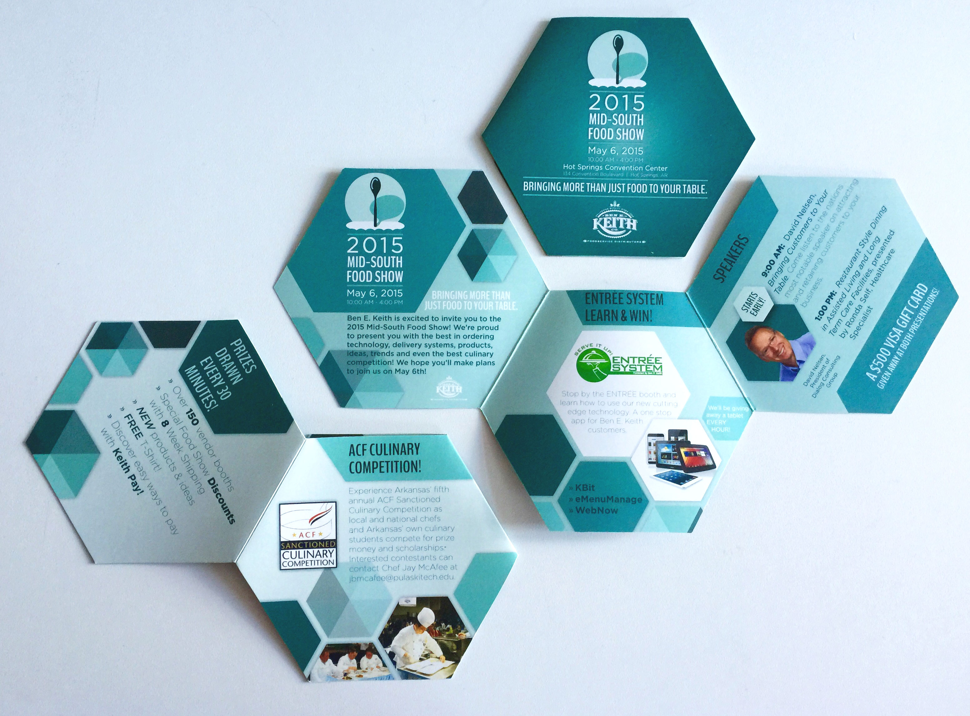
Historically, the speaking portion of the event had not yielded a great deal of interest from participants. However, this year they had made a special effort to acquire speakers they thought would generate interest and likewise wanted to be sure those seats were filled. Because of the time constraints of the show, the keynote speaker would present one hour before the published event start time. The night before the event the staff cut-off the portion of the leftover brochures that featured the speaking schedule on one side and the cover graphic on the other. They handed those out to guests at their party the night before in an effort to drive traffic to both the early speaking event and the mid-day presenter. The result was great. Both the speaking events and the food show was well attended. They indicated that not only was the design creative and very fitting for the event, but that the hexagon brochure design was also key in getting attention and sparking conversation. Their only wish is that they had utilized the logo design in more of the event’s promotional items like tee shirts and banners.