What’s New Wednesday – Negative Space
If you are familiar with any visual or graphic design related topics, you probably have heard or even used the phrase, “white space is our friend.” White space, or negative space, is simply that: an unmarked portion of a related graphic, print, canvas or other medium where images or text do not appear. I’ve recently come across an interesting use of negative space that is more literal in nature. It is space so negative, that it doesn’t exist. In theory and in reality, it is full of holes.
Vinyl banners have been a mainstay for outdoor announcements and signage. You see them everywhere – grand openings, auto dealerships, community and sporting events. Banners and signs like these are affordable and effective sales tools. They begin working the moment you put them up, and don’t stop until you take them down. And when the need arises for these to be outdoors for an extended amount of time, or depending upon the height at which these banners will be displayed, you may notice banners with half-moon slits cut into them. This is done to allow the wind to pass through the banners. After all, most advertisers would prefer that they remain banners, and not 6’x10’ sails.
But this may not be the most attractive answer to this problem.
Fortunately, an esthetic and functional solution exists, and it’s a wholly pleasant improvement to the situation that involves negative space. Or it’s a holey improvement. Mesh Banner material, a digital media that is 60% material and 40% air (give or take) provides a solution that has some rather eye-catching benefits. This material holds full color images in a stunning fashion, and actually blends into the environment with a near translucent effect depending upon where the direct light hits it.
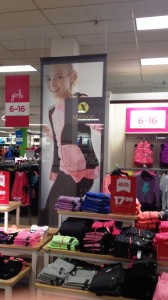
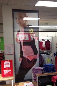
Until recently, I was under the impression that this material was best suited for outdoor environments only. But a visit to JCPenney in North Little Rock showed me how effective this material can be indoors too, especially in the retail environment. In the photos below, you can see how this mesh banner provides an artistic product backdrop when the primary light source is in front of it. Yet, it can appear nearly translucent allowing for product display behind it when the stronger light is behind it.
It becomes a very affordable, yet highly effective piece of interior display design.
So if you are looking for an effective way to get your message across, don’t make your audience read between the lines. Instead, let them look through the holes.

Paul Strack [email protected] @pstrack


