Posts

SignsXM Launches with Out-of-the-Box Lumpy Mail

BUSINESS OBJECTIVES

CustomXM added a new division, SignsXM. It wanted to find a unique way to announce its new offerings which included all types of wide format printing, including banners, signage, wall graphics, vehicle graphics and more. CustomXM also wanted to use a cross media, multi-channel approach that would drive results and illustrate CustomXM’s marketing capabilities.

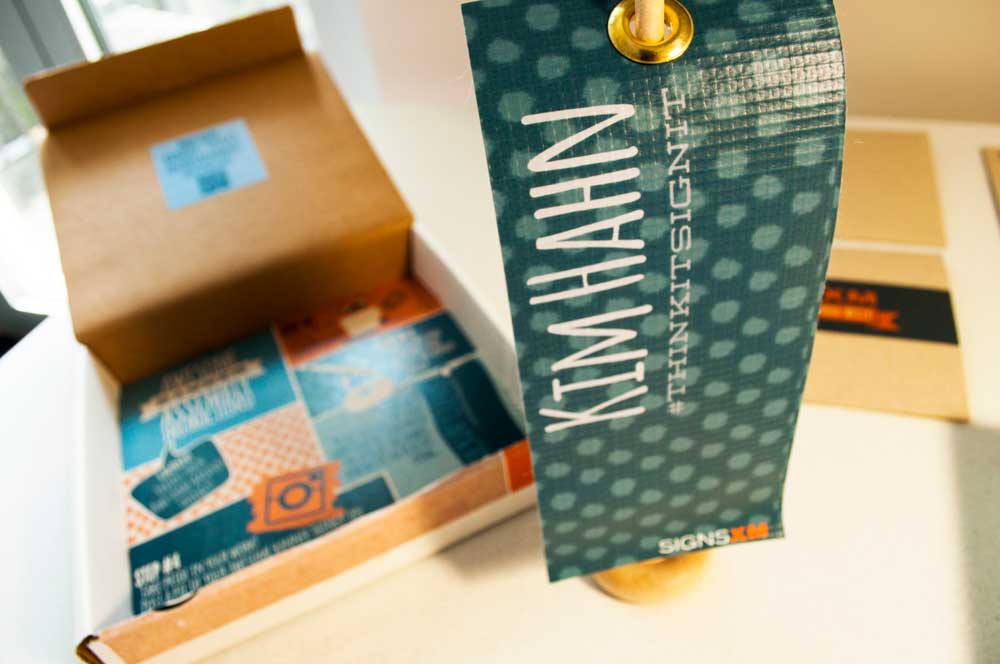
The SignsXM Awesome Banner Thingy Campaign: Complete with personalized box, envelope, personalized mini-banner and a fun-to-follow instruction sheet below. The inside of the box lid had a QR code that led to a fun video


RESULTS

CustomXM created a unique, dimensional mail piece that included a personalized mini-banner for all recipients. CustomXM encouraged recipients of their “Awesome Banner Thingys” to post photos on Instagram, which would qualify them for entry into a prize drawing.

420 pieces were mailed to prospects and current clients of CustomXM. Over 12% of recipients responded and completed the online survey. Additionally, over 13% of the recipients posted photos of their Awesome Banner Thingys on  Instagram accounts. Many of these respondents were a different subset than those that responded to the online survey.

The campaign received quite a bit of social media buzz and accolades from local ad agencies. It immediately led to meetings and opportunities for signage and direct mail proposals for clients and prospects. Many of these opportunities led to new business within the first three weeks of the campaign.

This campaign also received national recognition by receiving two Bennys awarded by the Print Industries of America during their Premier Print Awards, an international print competition.

TARGET AUDIENCE

The targeted audience was current clients and prospects of CustomXM.

SOLUTION ARCHITECTURE

At CustomXM, they like to market themselves a little differently. They like to use the marketing tools they are constantly advocating, and they like to have a little fun. They accomplished all this and more with their “Awesome Banner Thingy” campaign.

Recently, CustomXM added wide format services to their offerings. They even created a separate division, SignsXM. But they felt that it wouldn’t be enough just to tell folks about these new services, it would be better to show them. And have them show others.

To engage its target audience, CustomXM developed a dimensional mailer – an 8” x 8” x 1.25” box complete with a personalized label informing recipients that a “surprise” was inside. Inside the box was the following:

  • A personalized envelope and note card introducing the new division and services.
  • An instruction sheet showing recipients how to put together their own Awesome Banner Thingy
  • A QR Code that linked to a video explaining how to construct the Awesome Banner Thingy
  • The actual Awesome Banner Thingy which was a 3.25” x 7.5” vinyl banner, personalized with the recipient’s name, complete with a grommet and very tiny banner stand.

To encourage responses recipients were given two opportunities to participate in a prize contest

  • By visiting their personalized website and completing a survey
  • By sharing a photo of their Awesome Banner Thingy on Instagram
box_campaign_INSTAshots

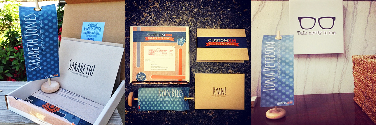
Above:  photos posted by Box Thingy recipients. Recipients were asked to post photos of their banner-thingys on Instagram with the hashtag #thinkitsignit. The Instagramers were entered into 3 different sets of drawings for prizes and winners were announced via Instagram videos.


REASONS FOR SUCCESS

The main reason for success was a clever design and personalized promotion.


Article courtesy of W. Caslon & Company, 2015, PODi.org

Arkansas Regional Innovation Hub Logo

The Arkansas Regional Innovation Hub approached CustomXM about creating a logo for “The Hub” that reflected their purpose and appealed to their varied and in-the-know target audience. The Innovation Hub represents a new effort aimed at promoting entrepreneurship through business incubation, academic research, technical and manufacturing assistance and job training in central Arkansas.  With these aims in mind, it is the top-tier organization for the creative energies of three separate, but related ventures – The Silver Mine, Art Connection and the Launch Pad. These groups will be housed under the same roof and thrive in the atmosphere of collaboration and creativity.

The style for the logo and collateral needed to be clean, contemporary and edgy to appeal to an innovative audience that is well versed in contemporary trends. At the same time, we wanted the tone to have some wit about it, a down-to-Earth feel that was careful not to appear stuffy, exclusive or restrictive, as highly modern design risk coming across.  The Hub’s vision of being a place that welcomes everyone –  from the young, novice student to the well established professional. A vision of being, perhaps above all, being a place that encourages creative exploration and hands-on experimentation would be a vital part of how their look would take shape.  Additionally, it was important that the logo reflect a sense of place, community and of being a central “hub” for so many different initiatives.

DSC_6138The solution successfully captured all it set out to do.  The drop-pin icon – a current symbol now recognized universally as the badge of “place” – points to an ambiguous surface revealed only by two concentric circles that work to further enhance the importance of the pin’s marked-site. The circles appear to be ripples in the surface, perhaps made from the impact of the pin’s fresh landing – not a coincidental reference to  The Hub’s goal of making some serious waves here in central Arkansas.  Script type used for the words “The” and “Hub” recall mid-century style and compliment the rigid and forward slanted sans serif used for “innovation” – which appears to be caught in the act of innovating both upward and forward.  The letters IN are made red to support the idea of being “the IN place”- being IN-the-know, getting people INvolved, and further emphasize the concept of place and INcluding everyones interests.

TheHub_businesscard_mockup

The administrative staff of The Innovation Hub currently leads a sort of nomadic existence while they await the completion of The Hub building (although subject to change at any moment, as we speak the Hub staff is actually working just down the hall from us at our sales and marketing office location)  We have assisted with exterior branding during their stint at 419 Main Street, printing and installing this window graphic last November.  Subsequently, 419 Main Street is now the HQ for the online retailer Bourbon and Boots. We were stoked when they asked us to outfit them with their window graphic too!
In addition to the work we’ve done, we also have just started brainstorming big plans for some pretty cool large-scale signage and wayfinding materials in the building once complete. More on that to come…

Seal Energy Solutions Rebranding

former-branding

Seal Energy Solutions is an energy assessment group providing commercial and residential spaces with energy audits and the retrofits needed to maximize energy efficiency. Finding themselves in a period of evolution and rapid growth, Seal approached CustomXM with task of polishing up their look. Their existing visual branding didn’t clearly communicate the services they provided, identify with their target audiences, nor did it reflect the new and innovative sense of their relatively young industry segment.  The structure in the existing logo looked like a house, however they also provide commercial services and even offer consulting services for builders and architects.

DSC_6511

Borrowing from the seasonal tree in the existing logo, CustomXM’s designers created an icon of four simplified leaf shapes that overlap to ultimately reveal the healing symbol of a cross in the center. The transparent leaf forms create a kaleidoscope of vibrant colors that reinforce the concept of of being in a modern and evolving industry, as well as borrow from our traditional color concepts of the four seasons. In conjunction with the leaf forms, colors also reference their eco-friendly initiative.

social-media

During the rebranding process CustomXM also assisted Seal with updating their name so that it included Energy Solutions. (which we initially intended to be the tagline).  We also structured the name so to ensure that it would no longer be displayed in all caps as though it were an acronym, a frequent assumption of their audience due to the former all-caps type treatment.

We have had so much positive feedback from the new branding… they love the look and colors and they understand better who Seal is and what we do. The fact that the brand [look] still accurately represents who we are today gives us confidence that the decisions made with its direction were correct… As a penny-pinching entrepreneur, that gives us further assurance that the money invested in the re-branding was well spent and truly an investment in our firm.  Heather Nelson, President and COO, Seal Energy Solutions

Very pleased with their new look, Seal has also commissioned CustomXM not only to create updated printed materials, but we also provide branding within their new office creatively displaying their logo in an oversized wall decal, supporting window graphics and plans for an outdoor sign. As well as shirts, hats and water bottles, CustomXM has also provided license plates and van decals, and looks forward to providing more Seal swag.