
Arkansas Regional Innovation Hub Logo
The Arkansas Regional Innovation Hub approached CustomXM about creating a logo for “The Hub” that reflected their purpose and appealed to their varied and in-the-know target audience. The Innovation Hub represents a new effort aimed at promoting entrepreneurship through business incubation, academic research, technical and manufacturing assistance and job training in central Arkansas. With these aims in mind, it is the top-tier organization for the creative energies of three separate, but related ventures – The Silver Mine, Art Connection and the Launch Pad. These groups will be housed under the same roof and thrive in the atmosphere of collaboration and creativity.
The style for the logo and collateral needed to be clean, contemporary and edgy to appeal to an innovative audience that is well versed in contemporary trends. At the same time, we wanted the tone to have some wit about it, a down-to-Earth feel that was careful not to appear stuffy, exclusive or restrictive, as highly modern design risk coming across. The Hub’s vision of being a place that welcomes everyone – from the young, novice student to the well established professional. A vision of being, perhaps above all, being a place that encourages creative exploration and hands-on experimentation would be a vital part of how their look would take shape. Additionally, it was important that the logo reflect a sense of place, community and of being a central “hub” for so many different initiatives.
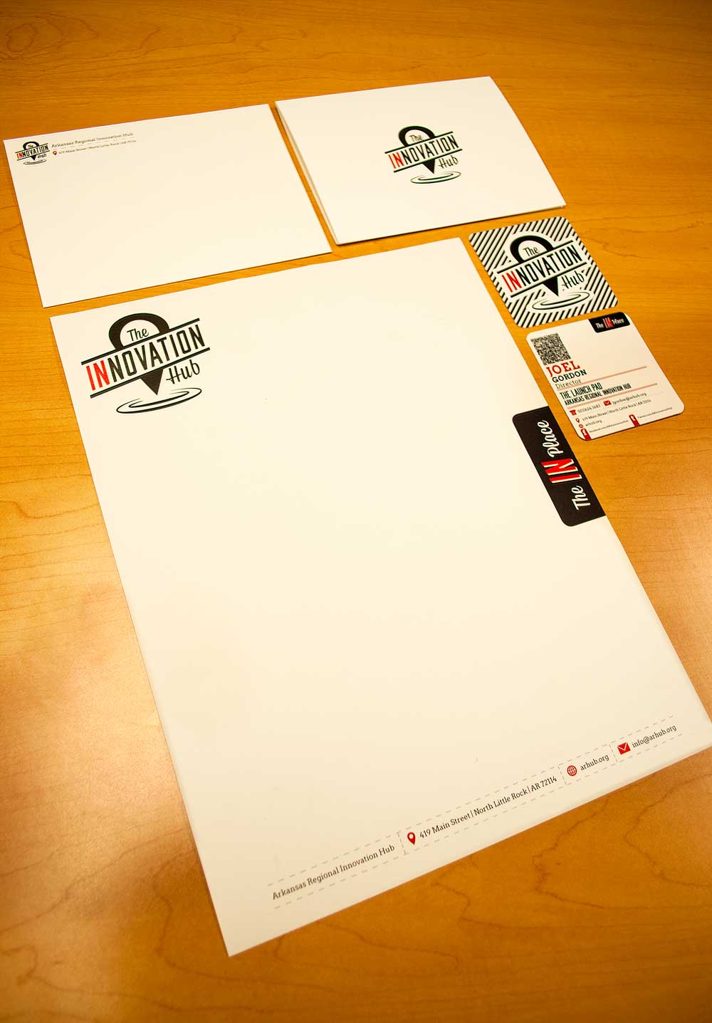 The solution successfully captured all it set out to do. The drop-pin icon – a current symbol now recognized universally as the badge of “place” – points to an ambiguous surface revealed only by two concentric circles that work to further enhance the importance of the pin’s marked-site. The circles appear to be ripples in the surface, perhaps made from the impact of the pin’s fresh landing – not a coincidental reference to The Hub’s goal of making some serious waves here in central Arkansas. Script type used for the words “The” and “Hub” recall mid-century style and compliment the rigid and forward slanted sans serif used for “innovation” – which appears to be caught in the act of innovating both upward and forward. The letters IN are made red to support the idea of being “the IN place”- being IN-the-know, getting people INvolved, and further emphasize the concept of place and INcluding everyones interests.
The administrative staff of The Innovation Hub currently leads a sort of nomadic existence while they await the completion of The Hub building (although subject to change at any moment, as we speak the Hub staff is actually working just down the hall from us at our sales and marketing office location) We have assisted with exterior branding during their stint at 419 Main Street, printing and installing this window graphic last November. Subsequently, 419 Main Street is now the HQ for the online retailer Bourbon and Boots. We were stoked when they asked us to outfit them with their window graphic too!
In addition to the work we’ve done, we also have just started brainstorming big plans for some pretty cool large-scale signage and wayfinding materials in the building once complete. More on that to come…


